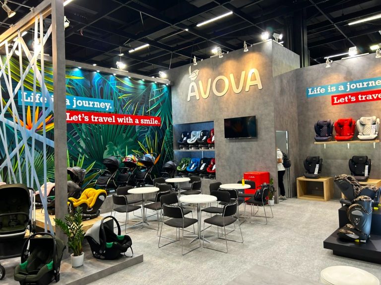
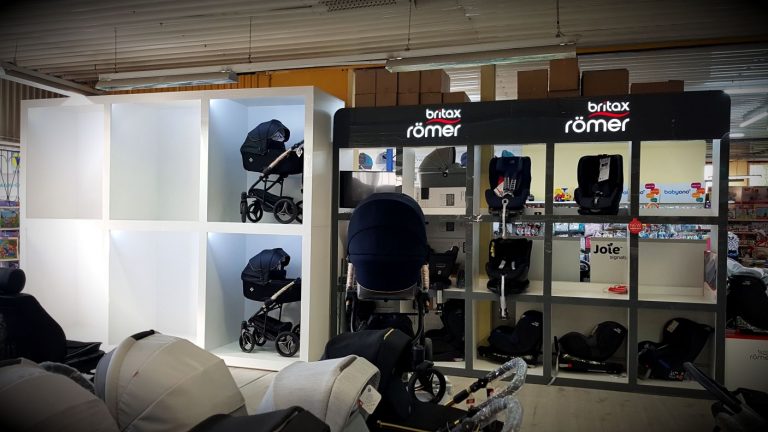
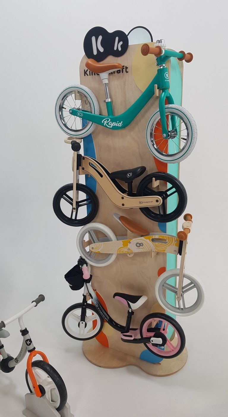
DISPLAY SHELVING UNIT
“BABY ON TOUR” CHILDREN’S STORE FURNITURE
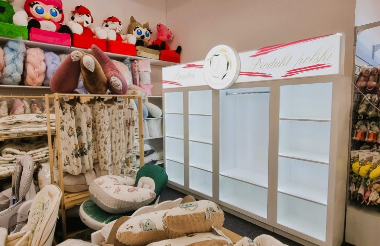
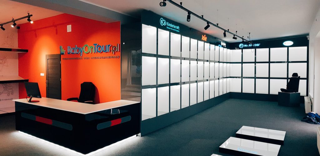
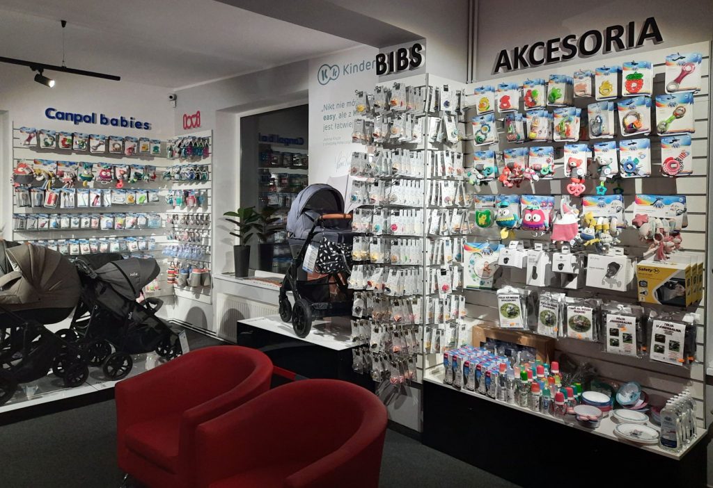
We designed display shelving unit in the store from scratch, from raw brick. First of all, qualitative measurements of the surface were very important. Shelves, racks and platforms fit perfectly into the recesses, “tailor-made” 🙂
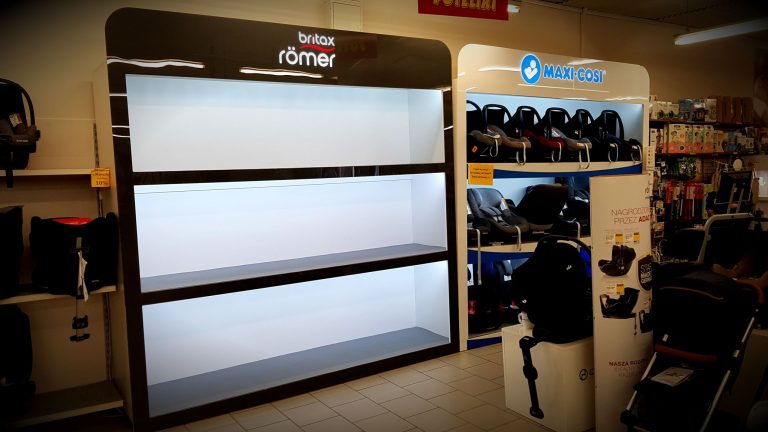
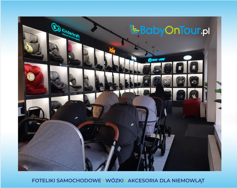
ILLUMINATED SHELVES
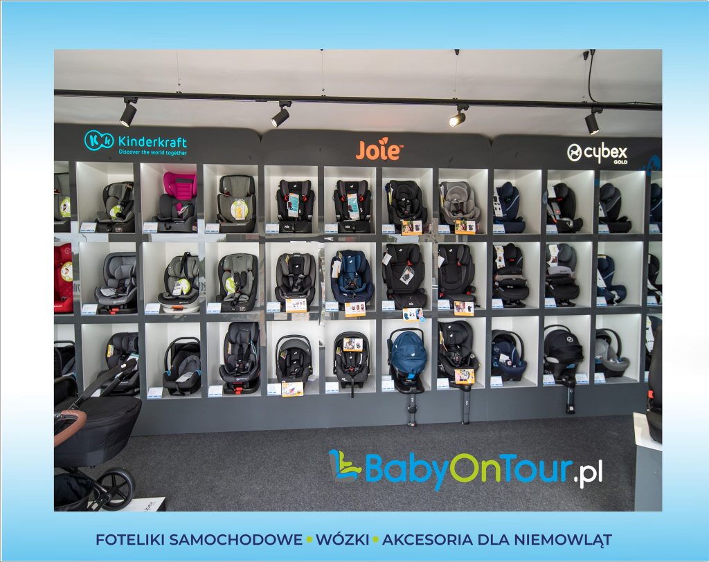
The row of shelves has been illuminated, the logos also shine. They dominate the entire decor. The lower shelf is raised by 35 cm from the floor to make it easier to present the seat base, which is equipped with a stabilizing leg. The furniture of the children’s store provides for the interplay of all elements in the space. Customer does not get lost in the salon. These are usually large-format stores, which is why it is so important that their space is organized and intuitive.

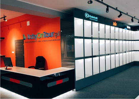
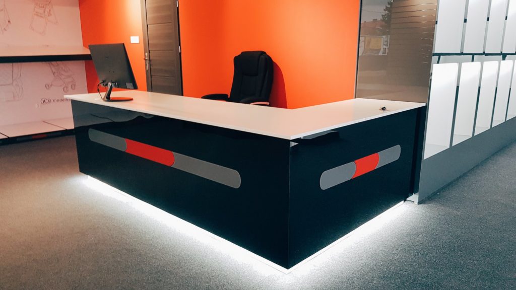
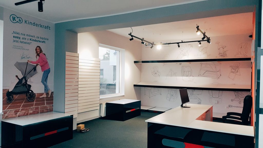
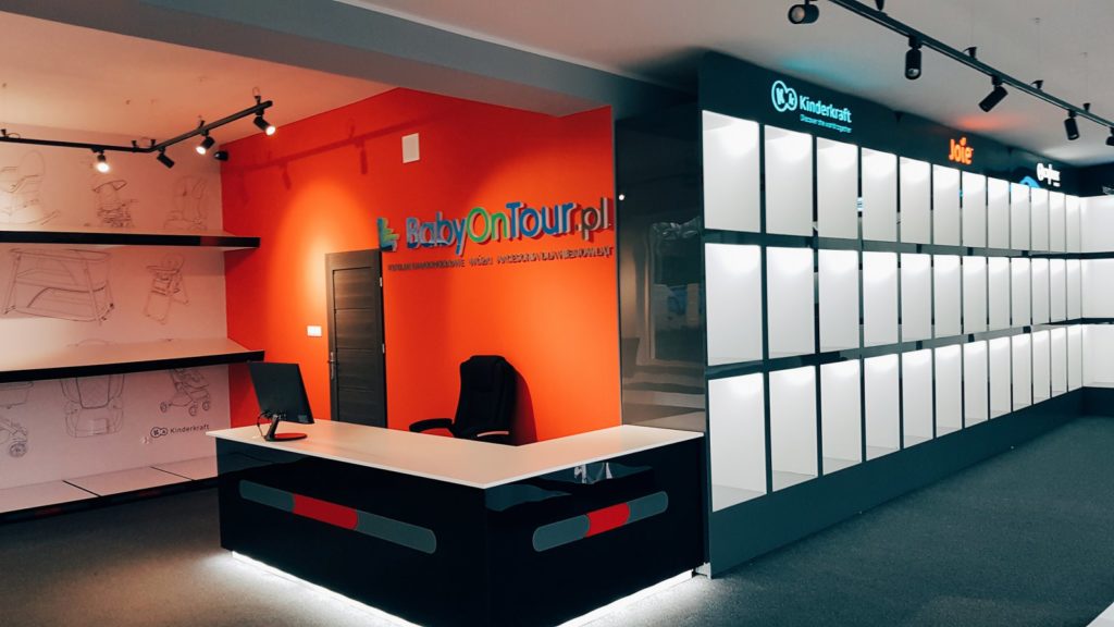
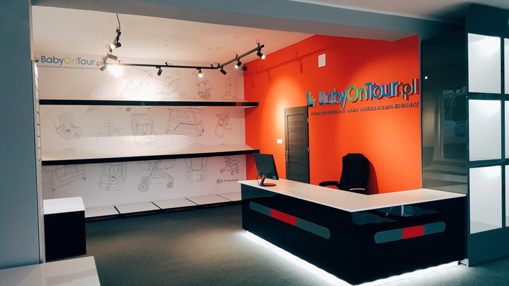
ADDITIONAL ELEMENTS OF FURNITURE FOR A CHILDREN’S STORE
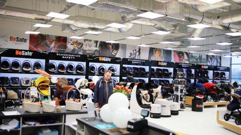
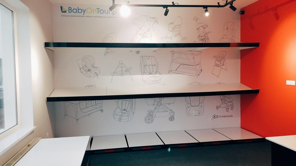
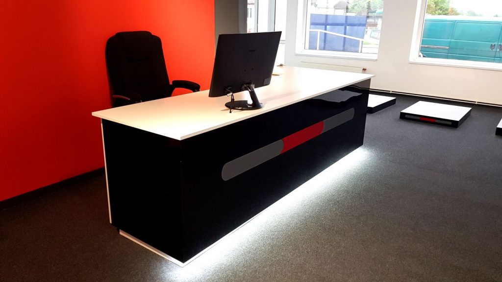
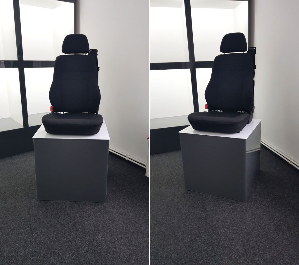
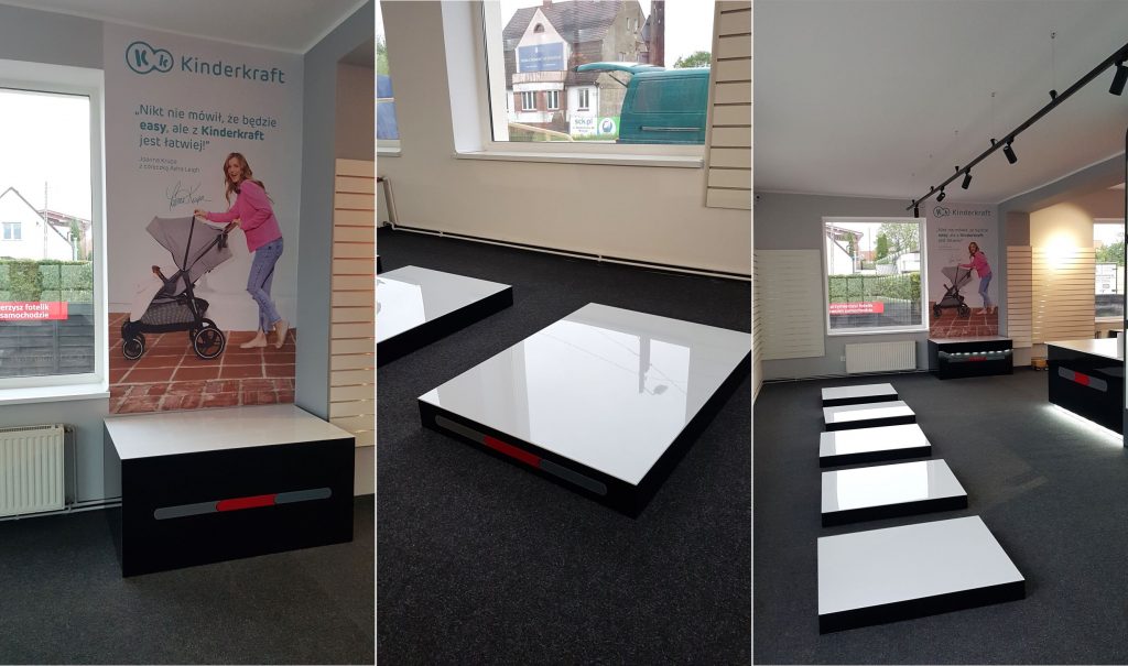
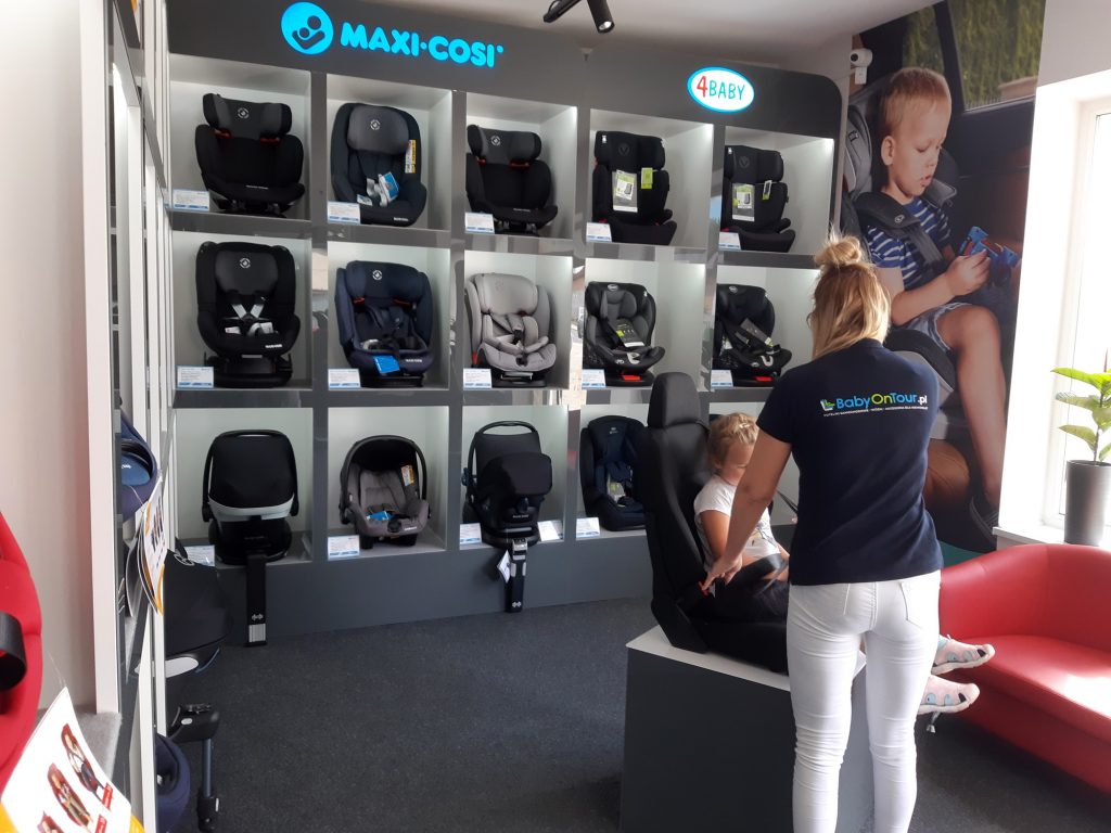
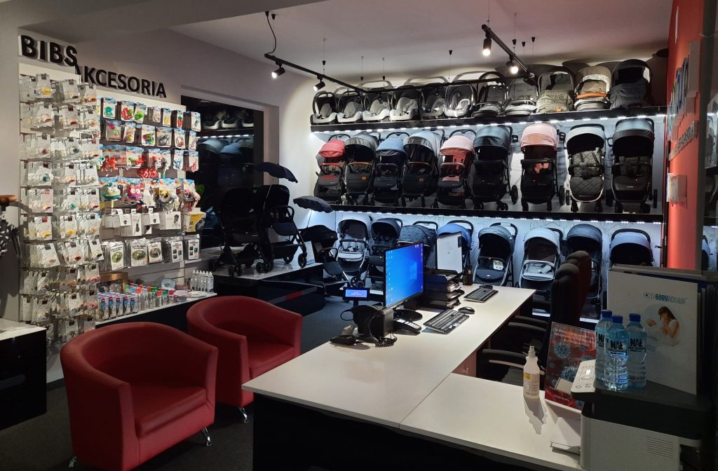
In addition, we have prepared a functional counter in the color of the store, shelves with graphics glued directly to the walls and built the spacewall system with “inconvenient” pillars and recesses. For a detailed presentation of the functionality of car seats, separate platforms with display seats are used, but there are also platforms of different heights. Everything is consistent and well thought out.
EFFICIENT, QUICK ASSEMBLY
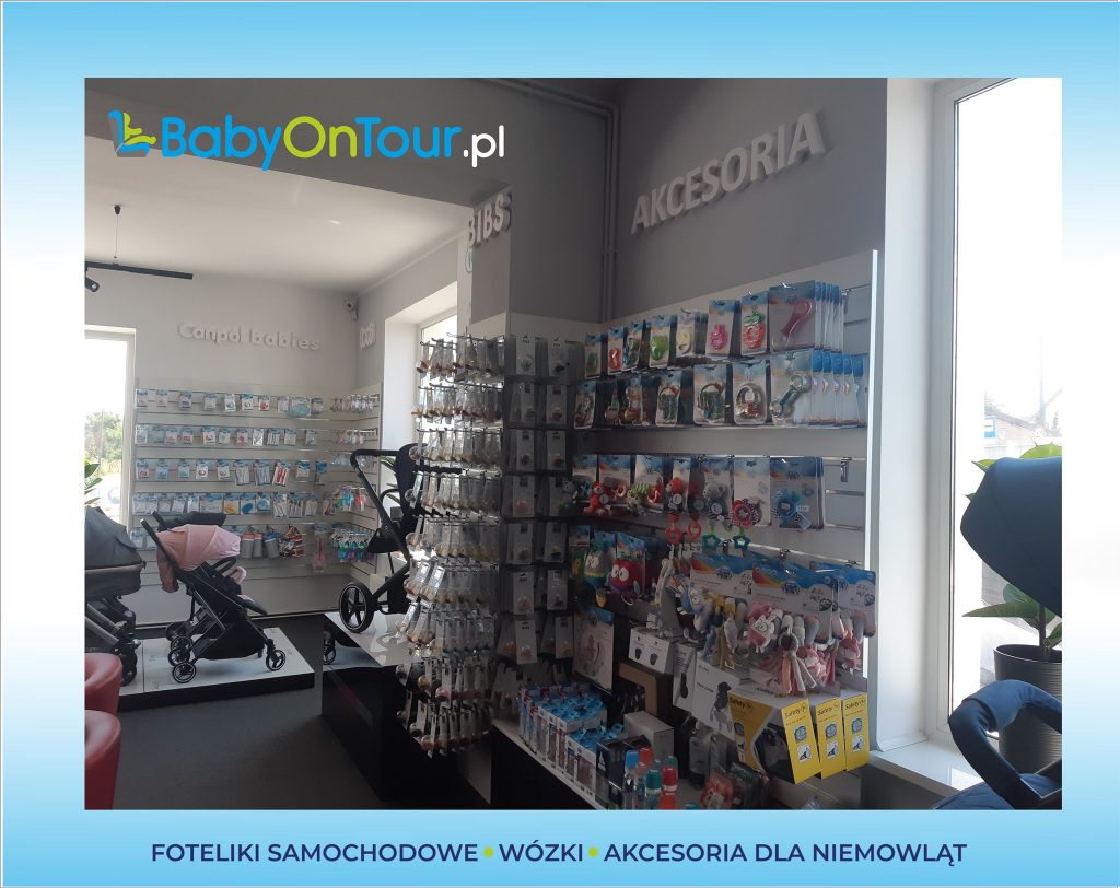
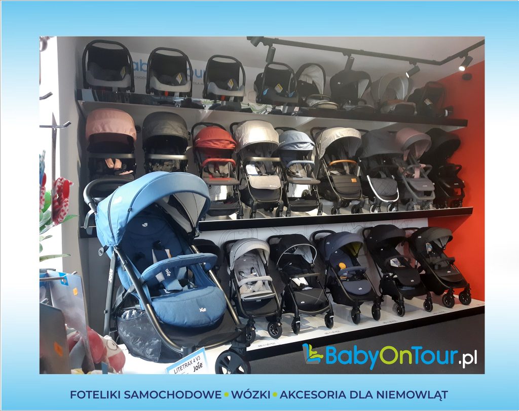
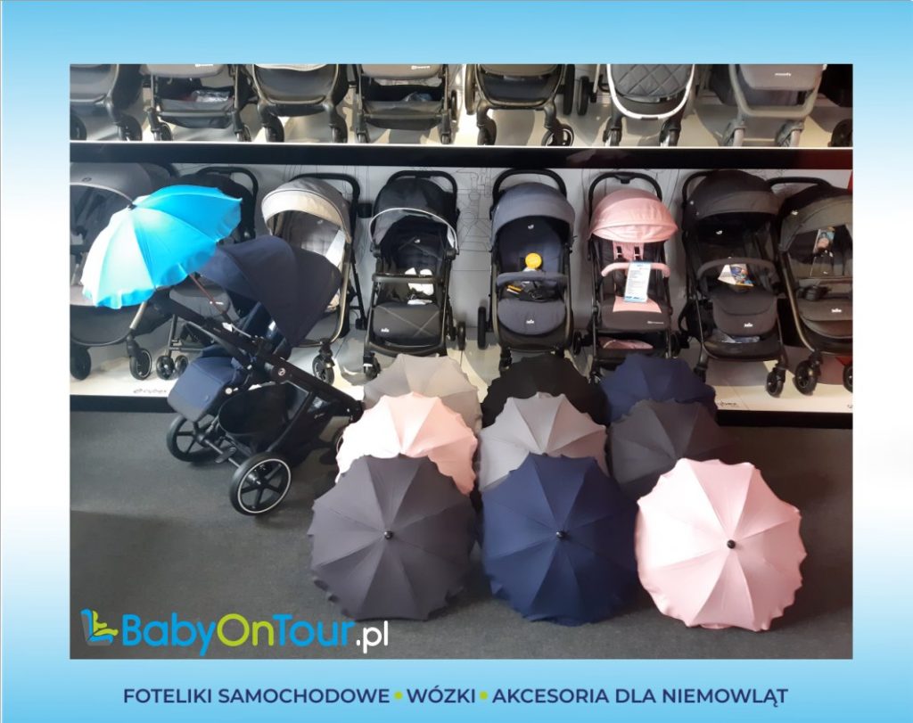
The assembly of furniture on such a large area was primarily a considerable logistical challenge – the store is located in Szczecin and we brought all the elements from Silesia. Below is a photo of what the interior looks like after stocking up. Photos courtesy of the store.
OZNAKOWANIE SKLEPU REKLAMĄ
In the final stage, we marked the store with advertising from the outside – illuminated graphics but also banners and boards. The salon is called Baby on Tour (elmo.pl) as a result it is visible from a distance.
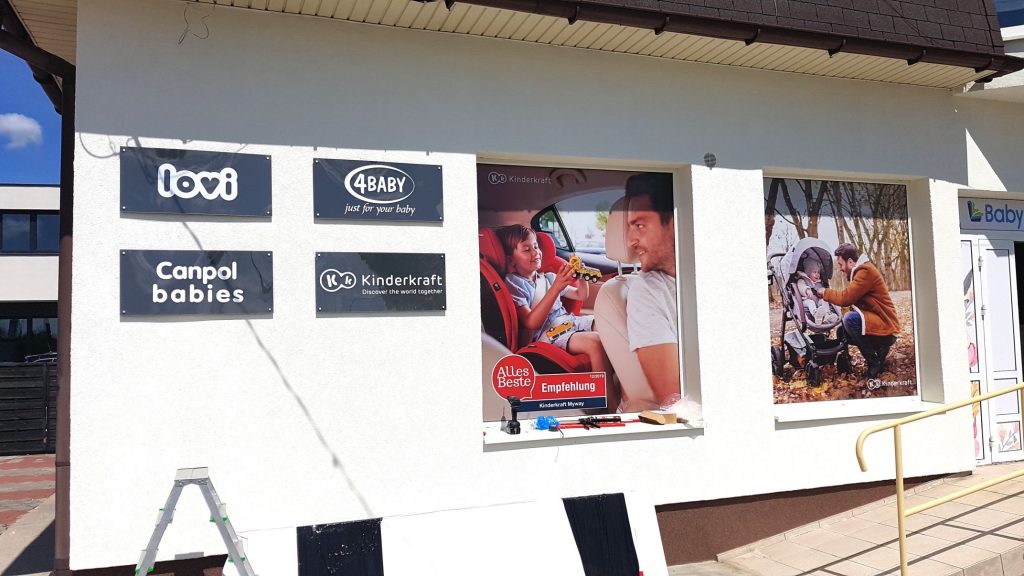
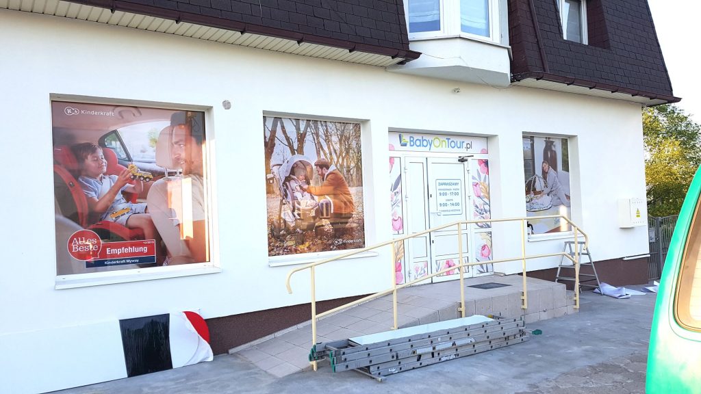
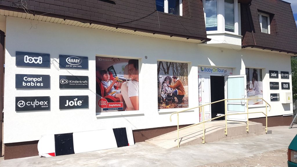
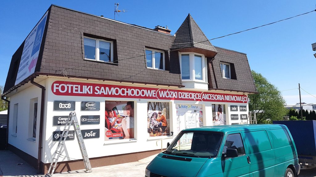
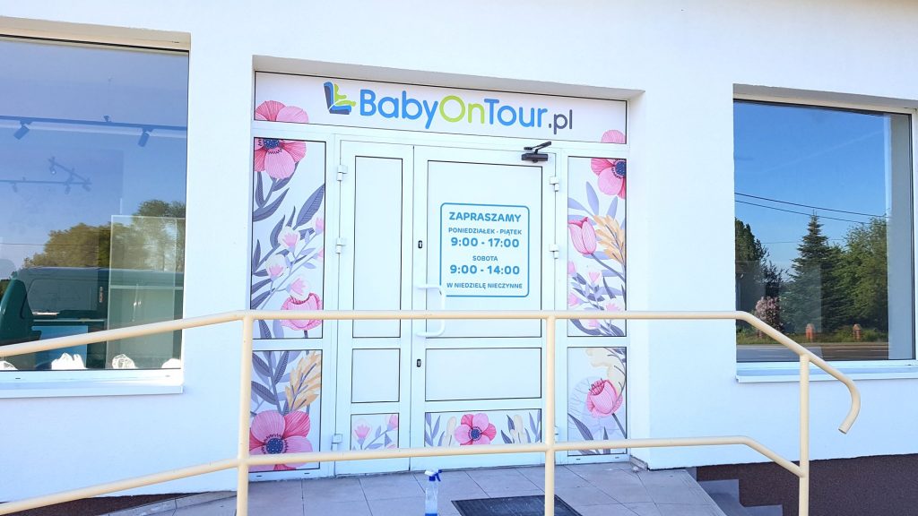
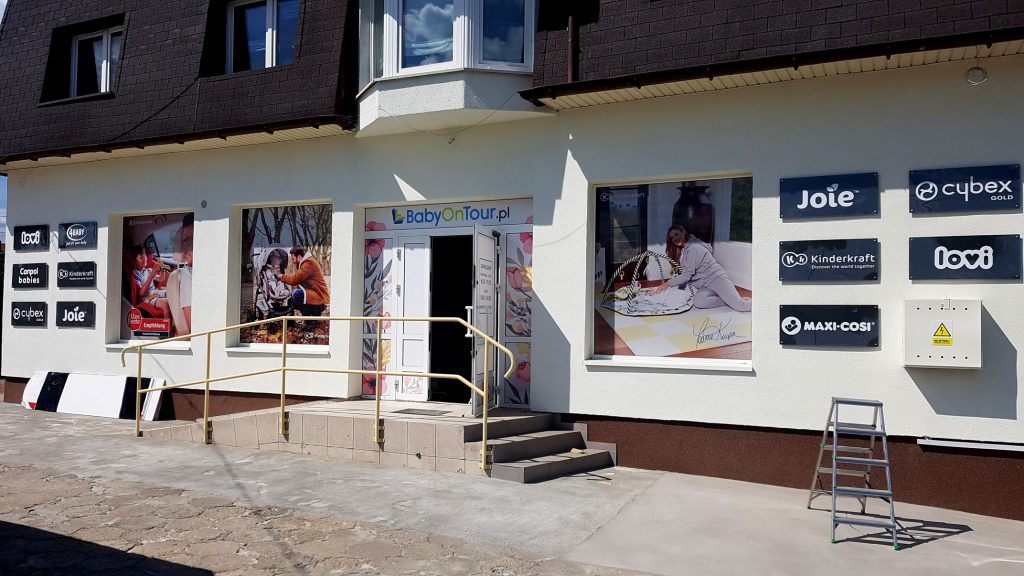

We marked the building inside and out. Primarily spatial letters, lifestyle graphics that were glued to the windows. Plates at distances with the logos of the brands whose products are in the showroom.
Inside the store, a spatial, colorful logo, glued directly to the wall. Similarly, on the outside, a clear and aesthetic advertisement. You can see it HERE
